Unexpected combinations
Blackwell & Wootton
Creative
The challenge was to create a brand identity with a sophisticated yet artisanal personality for a husband & wife catering team, geared towards clients with a higher budget.
Through conversations with the client, three things came to light which inspired the creative approach – the couples’ contrasting yet complementary personalities, their different roles within the company (Blackwell is the chef, Wootton manages the business) and the surprising and unconventional food they create.
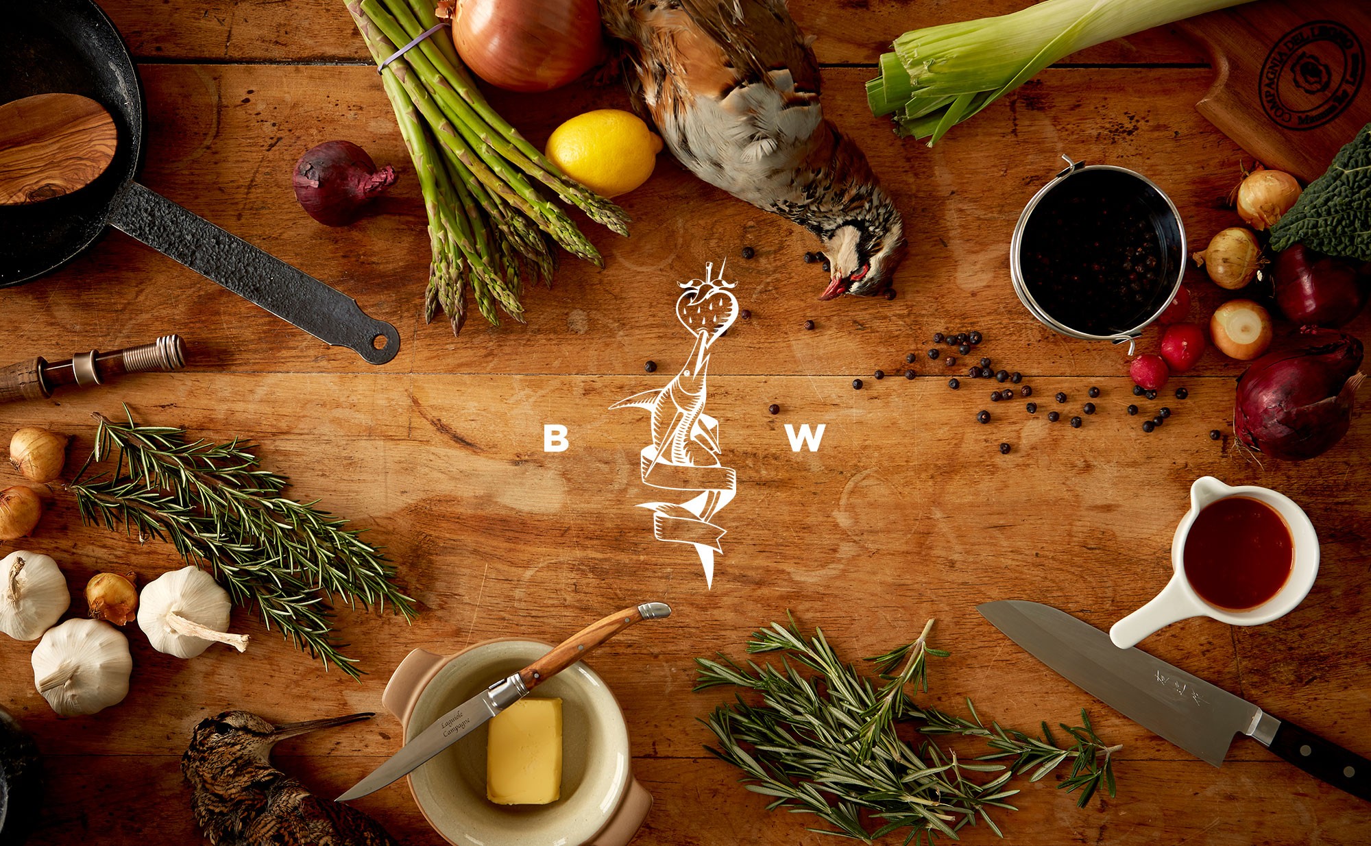
For the mark, I explored various expressions of the concept “unexpected combinations” to reflect their unique working relationship. The swordfish and strawberry motif particularly reminded Blackwell of something he’d seen as a child, evoking nostalgic memories of a childhood seaside visit. To convey craftsmanship and quality, I employed an intricate, etched style paired with a refined colour palette of golds, creams, and royal blues. I also designed a website featuring fullscreen imagery and parallax animations as the main touchpoint. Additionally, I gained valuable on-set experience during a bespoke photoshoot that beautifully captured the artistry of their culinary creations.
Unexpected combinations
Blackwell & Wootton
Creative
The challenge was to create a brand identity with a sophisticated yet artisanal personality for a husband & wife catering team, geared towards clients with a higher budget.
Through conversations with the client, three things came to light which inspired the creative approach – the couples’ contrasting yet complementary personalities, their different roles within the company (Blackwell is the chef, Wootton manages the business) and the surprising and unconventional food they create.
For the mark, I explored various expressions of the concept “unexpected combinations” to reflect their unique working relationship. The swordfish and strawberry motif particularly reminded Blackwell of something he’d seen as a child, evoking nostalgic memories of a childhood seaside visit. To convey craftsmanship and quality, I employed an intricate, etched style paired with a refined colour palette of golds, creams, and royal blues. I also designed a website featuring fullscreen imagery and parallax animations as the main touchpoint. Additionally, I gained valuable on-set experience during a bespoke photoshoot that beautifully captured the artistry of their culinary creations.


